Tuesday, 27 October 2009

MAIN TASK

The genre of my magazine will be Swing/Jazz; the combination of the two will exaggerate the modern twist to what the magazine will become


  • RESEARCH

1) Codes and Conventions of a Music Magazine Front Cover


  • One worded title Title -It has its own unique font and is the biggest text on the page


  • The title may fill the whole page width Positioning statement which is situated by the title ( above or below)


  • Price of magazine Date of issue/ issue number

  • * All of the above points are known as the “Masthead” Bar code ( on the front cover because adverts are usually on the back)


  • Puff (e.g. free gifts)

  • Lists Main image - This is anchored by the main cover-line


  • The main cover-line is the largest text after the title and is up to two lines long


  • Small pictures on the front show artists or bands


  • Cover-lines are two/three lines long, it gives information about contents, it intrigues the audience and provokes interest with as few words as possible Bold colours.


  • A consistent colour scheme is used


  • The main image usually does not have the band/singer smiling which conveys attitude


  • Directly addressed images are used (looking at the audience)


  • Typography - This is the look of the letters (limited fonts are used)


  • 2 types of typography: serif and sans serif


  • Serif = French for ‘HOOK’ e.g. ‘Times New Roman’


  • Sans serif = French for ‘WITHOUT HOOK’ e.g. ‘Ariel’


  • The connotations of font reflect target audience and subject


  • They frame an image – usually the left side


  • There is usually a strip at bottom or top which has different artists on it therefore this improves the content of the magazine front cover


  • It has a list of names/bands/topics Buzzwords are used e.g. EXCLUSIVE


  • The small use of colour conveys a classy feel to the magazine and makes it easy to be identifiable compared to other music magazines


  • The photography is very creative as it uses the light to contrast the images and the angles convey emotion within the images; especially the main image

2)Codes and Conventions of a Music Magazine Contents Page


  • Columns are used - Maybe two or three Page numbers


  • Picture and images with page numbers Images


  • ‘In this’ section (editor letter) – editorial – there is a picture of the editor and their signature Date and issue at the top


  • The title at the top of the page, sometimes top left = ‘Contents’

  • Quotes

  • Consistent colour schemed followed on from the front cover Categorise sections (headings

  • One large images Smaller images which highlight the content of the magazine

  • The actual arrangement: page numbers – then text

  • One or two words as the main line

  • They are bold and usually larger text

  • Sub line text is smaller

  • Regular content – this appears in every issue of the magazine. E.g. horoscopes

  • Feature content – this is the term used for ‘one-off’ stories. E.g. Interview with band

  • Bottom of the page consists of page numbers, title, issue data, website

  • Contact details

3) Codes and Conventions of a music magazine, Double Page Spread


  • There are usually 3 or 4 columns

  • Creative use of photographs

  • Quotes on pictures or maybe in between text separated by boxes, this invites the audience because it is highlighted with the use of panels and boxes

  • 1/2 the article is an image, pictured often bleed across from one page to the other


  • author of the article is stated (BYLINE is the name of journalist) This is positioned by the STAND FIRST

  • Stand first works with the headline to inform the reader about the article, it has a larger font, it is the beginning paragraph where opinions are usually used as is an informal style; this explores the journalist's personality

  • page numbers

  • small images are used to break up text

  • limited colours- colour scheme

  • name of band or artist is bold and sometimes in a different colour to stand out

  • further details

  • photographer's name and/or details

  • name of magazine and/or website

  • Drop capital is used and indicates were to start reading; the 1st letter of the 1st word is large

  • A strap line / border maybe used to bleed across the double paged spread or even used as a tab bar

  • headlines are situated across two pages (its eye catching and creative)

  • bold text in 1st introductory paragraph, and is again larger font


  • Magazine Research


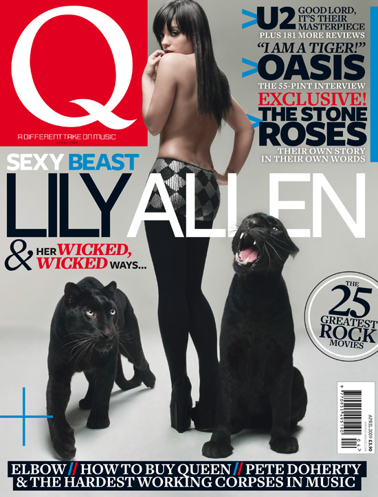
Q


Price: £3.90
Frequency of publication: Monthly
Issue Size (number of pages): 162

Regular content:
Soapbox
New to Q
Q hero
My record collection
Cash for Questions
A round with…
Q50 ( tines)
Q quiz
Last requests
Q review

Feature articles:
Interview with Sting
Interview with Green day
“Pop Babylon” (Whitney & Britney)


JAZZIZ


Price: $59.95 / £36.90 for subscription over year.
Import Price: Average/£9 per issue
Frequency of publication: Quarterly. (Every 3 months seasonal)
Issue size (number of pages): ?

Regular content:
Reissued Rankin
Free CD or DVD
Discover an artist
Quiz
Questions & Answers
Forums

Feature articles:
Paoli Mejia
Tom Beckham
Impressions by Peter
Jamie Cullum kicks


Questionnaire and Results

I have designed and created a questionnaire that will help me identify the key aspects of my music magazine. The following graphs represent the results from my questionniare, filled out by 20 people.
Saturday, 3 October 2009

Preliminary exercise

  • Research

    1) Codes and Conventions of a Music Magazine Front Cover
    One worded title
    Title -It has its own unique font and is the biggest text on the page
    The title may fill the whole page width
    Positioning statement which is situated by the title ( above or below)
    Price of magazine
    Date of issue/ issue number
    * All of the above points are known as the “Masthead”
    Barcode ( on the front cover because adverts are usually on the back)
    Puff (e.g. free gifts)
    Lists
    Main image - This is anchored by the main cover-line
    The main cover-line is the largest text after the title and is up to two lines long
    Cover-lines and relevant images
    Cover-lines are two/three lines long, it gives information about contents, it intrigues the audience and provokes interest with as few words as possible
    Bold colours. A consistent colour scheme is used
    The main image usually does not have the band/singer smiling which conveys attitude
    Directly addressed images are used (looking at the audience)
    Typography - This is the look of the letters (limited fonts are used)
    2 types of typography: serif and sans serif
    Serif = French for ‘HOOK’ e.g. ‘Times New Roman’
    Sans serif = French for ‘WITHOUT HOOK’ e.g. ‘Ariel’
    The connotations of font reflect target audience and subject
    They frame an image – usually the left side
    Strip at bottom or top. It has a list of names/bands/topics
    Buzzwords are used e.g. EXCLUSIVE


    2)Codes and Conventions of a Music Magazine Contents Page
    Columns are used - Maybe two or three
    Page numbers
    Picture and images with page numbers
    Images
    ‘In this’ section (editor letter) – editorial – there is a picture of the editor and their signature
    Date and issue at the top
    The title at the top of the page, sometimes top left = ‘Contents’
    Quotes
    Consistent colour schemed followed on from the front cover
    Categorise sections (headings)
    One large images
    Smaller images which highlight the content of the magazine
    Subscription
    Plain and simple backgrounds; usually white so that everything stands out
    Content
    The actual arrangement: page numbers – then text. One or two words as the main line. They are bold and usually larger text. Sub line text is smaller
    Regular content – this appears in every issue of the magazine. E.g. horoscopes
    Feature content – this is the term used for ‘one-off’ stories. E.g. Interview with band
    Bottom of the page consists of page numbers, title, issue data, website
    Contact details


  • Planning

These are rough sketches of my school magazine front cover and contents page


  • Production


Used on contents page Used on contents page


Used on contents page

Used on contents page

Used as main background image of front cover
Used on the contents page

Used on front cover as coverline image


Used on front cover as coverline image

Used on front cover as coverline image

Used on contents page


Used as biggest image on contents page

Used on contents page

Used as the main image on the front cover

Not used
Used on front cover in bottom corner

- Finished front cover page and contents

This is the school magazine front cover

This is the school magazine front cover


  • Evaluation
The preliminary task that I had to achieve needed to follow the codes and conventions of a music magazine. However due to the lack of time we had to design and publish our magazine not all conventions were followed for example: a unique use of typography for the magazine title was not thoroughly explored therefore it may have not been easily recognisable compared to other media products. However I did use one type of typography on the title, this was the serif font which foreshadows the “school” genre of the magazine.
Moreover, conventions were applied to the school front cover, i.e. the main image was anchored by a main coverline “students on the net”, and it was also a medium close up of a student in uniform which follows the rules of this task. Thus the masthead was made up of a relevant magazine title, issue date and number and the price of the magazine, (which was in IRIS rewards and links to the school points system at Weatherhead High).
The background of the front cover is an empty playground which suggests the school genre and follows conventions of having a simple background. Nevertheless the background is not ‘the usual’ white-colour and therefore does not emphasise all the other features on the front cover. Techniques such as buzzwords have been included in order to entice the reader.
In addition several coverlines were spread about the front cover with corresponding images that linked well to the genre of the magazine, and helped to attract the target audience of school pupils, for example: “room 4 common room”. Furthermore, the contents page consists of a smaller main image which has been transferred from the front cover; it is situated under the magazine title and the words “contents”. Underneath this, there are three columns that include regular content articles, feature content articles and images which have corresponding page number on top of them the convention of not including the “p” –short for page- is followed on the contents). In addition, a simple colour scheme is used throughout and develops the magazine using conventions.
The front cover was created through the programme Adobe Photoshop which I previously had experience with but the contents page was created using Quark Xpress; this meant that we had to learn the new software in order to produce our product. The strengths of my school magazine are that most conventions are followed and not broken however it is obvious that there are areas that can be greatly improved. For example: I think that one of the biggest weaknesses of my product was that the main image on the front cover needed more attention because it should be a good medium close up and an image that really does lure the reader/target audience in.
Overall, I believe that my magazine served its purpose of creating a brand new, exciting school magazine; however there is room for a lot of improvement for example I can identify key tips to help me use the new professional software Quark Xpress. The codes and conventions were easily followed and this exercise will help me to produce a good-quality final product.